Younited Wellness
Building a purpose-led nutrition brand from the name up.
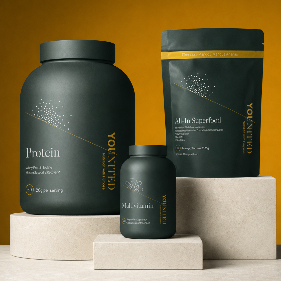
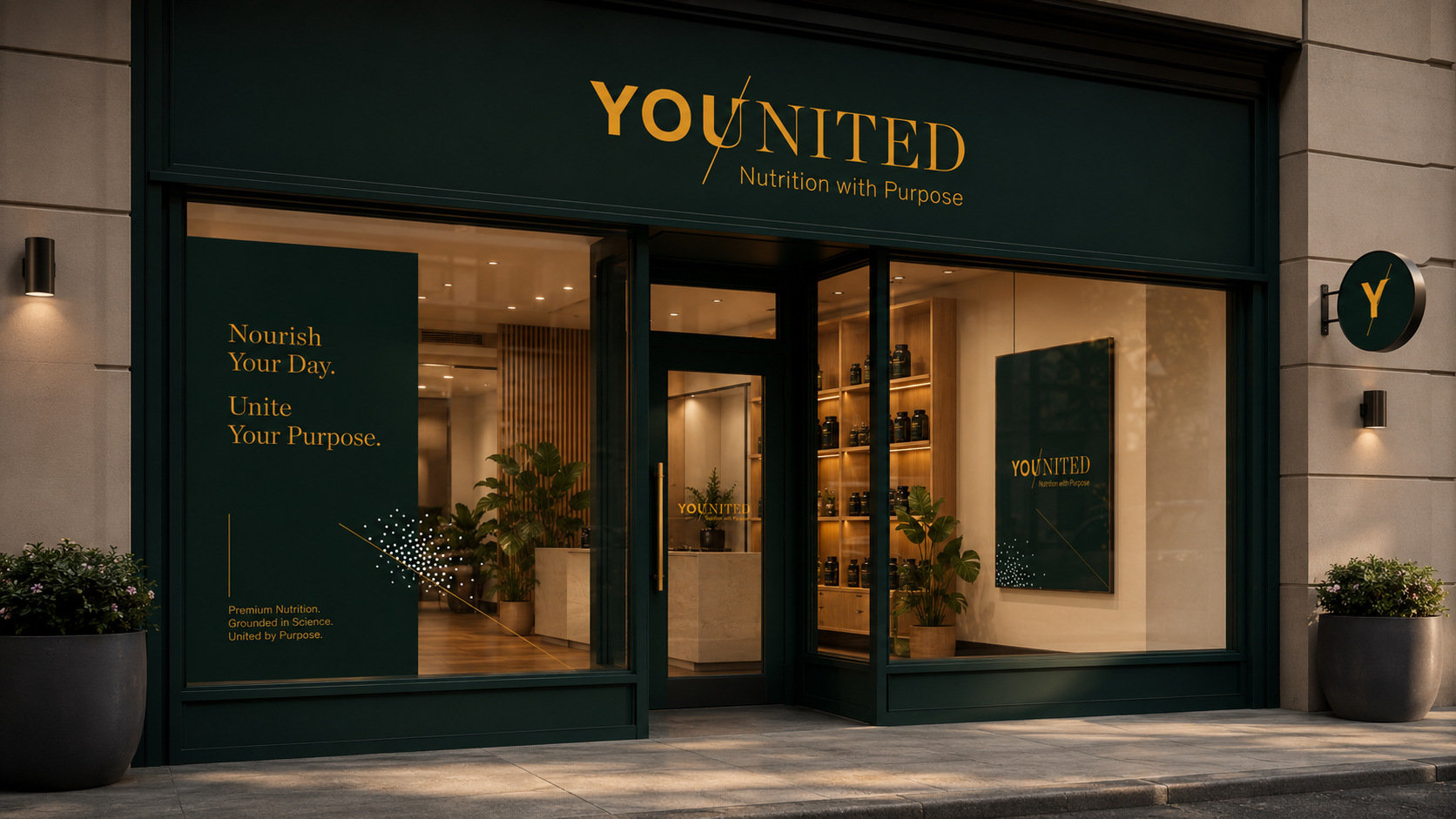
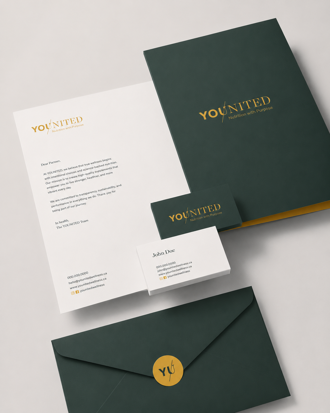
Younited needed to stand apart in a crowded nutrition category. The opportunity was to create a brand with more depth than performance benefits alone. A brand rooted in the alignment of body, mind, and spirit.
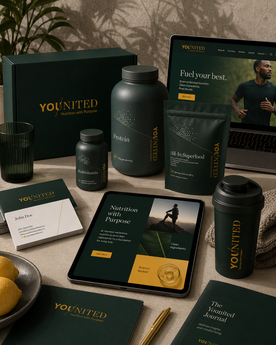
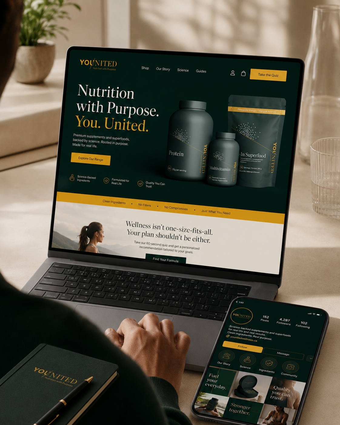
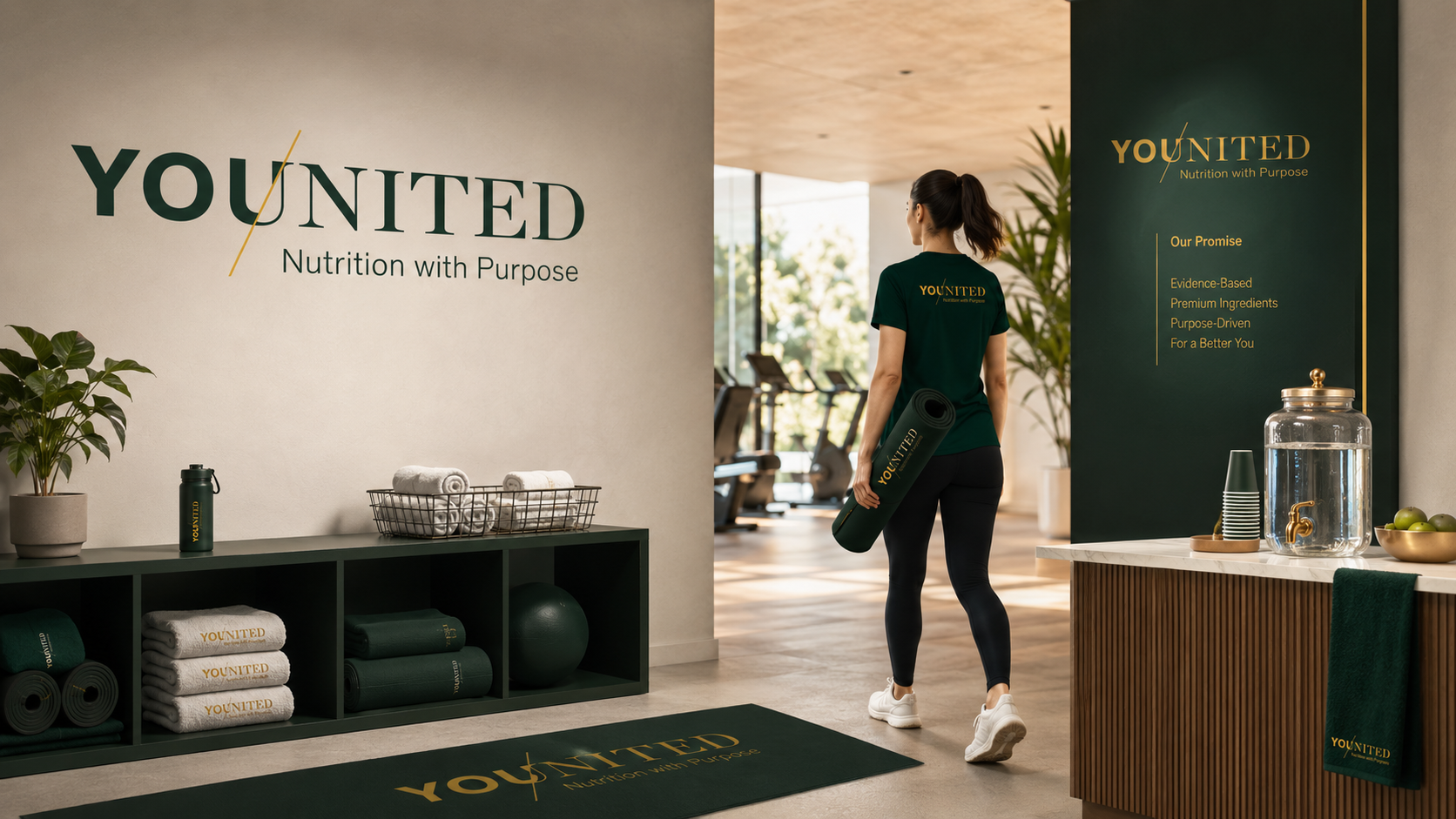
Unbound developed the name, positioning, visual identity, and packaging system. Younited brought together “You” and “United,” with the shared U becoming a symbol of wholeness, focus, and forward momentum.
The platform, Nutrition with Purpose, gave the brand a clear belief system beyond product function.
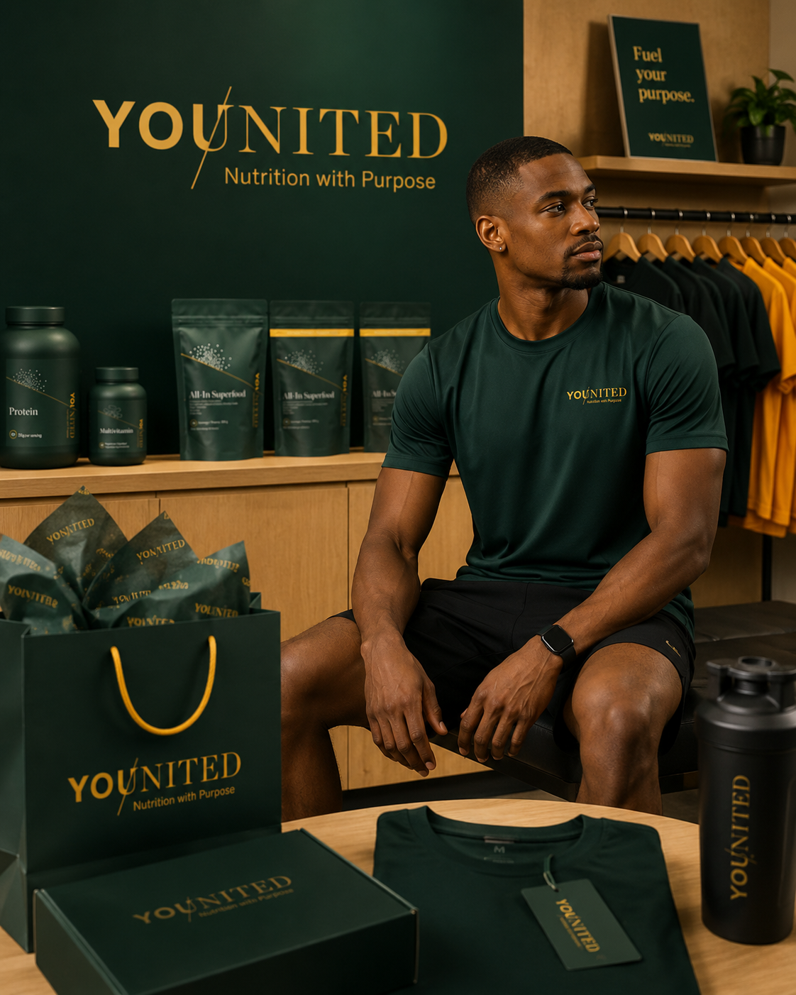
The visual world was built for meaning and distinction. Colour, typography, photography, and the proprietary Younited Slash created a brand language that felt elevated, active, and intentional. The translucent green bottle, green lid, and Zeal Orange accents gave the packaging strong shelf presence and immediate recognition.